| Entrance | Mainstreet | Wiki | Register |
|
# of watchers: 13
| D20: 8 |
| Wiki-page rating |  Stumble! Stumble! |
| Informative: | 0 |
| Artistic: | 0 |
| Funny-rating: | 0 |
| Friendly: | 0 |


2010-06-10 [Chel.]: New.
2010-06-10 [Aeolynn]: I really like the colors, and overall flow of this piece, however some definition lines are bugging me. The colors separating her thighs is the main one, seems like there needs to be more of a contrast, or it might just be this shitty school comp monitor.
Lol...
2010-06-10 [Chel.]: No, they need to be more defined.... otherwise at a glance it looks like one fat thigh.... thanks Aeo! <3
2010-06-10 [Aeolynn]: <3
2010-06-11 [arthemis_]: Oh wow! I don't have any critiques here, I simply love it!
2010-06-12 [Teufelsweib]: it's so cuuuuute ^^
2010-06-13 [pegasus1000]: This picture is supper cute and I love it, for a cartoon it is perfect. The colors and shading of the skin are great. I love the flower in her hair and the short feathers between the wings and her back. If you are trying for realistic proportions: Where the top falls in the front is too high up, as it is the top would be covering her caller bones and just barely cover her nipples. Perhaps you should just consider lengthening that area just a little. The hands could be a little longer too, as long as the feet. Great job.
2010-06-13 [Aeolynn]: hands are never as long as feet =P
2010-06-13 [Chel.]: A realistic hand should be as big as one's face....but I'm not really going that realistic...as you can tell from the noodle arms. :P
2010-06-14 [Chel.]: NEW SORTA.
2010-06-14 [Aeolynn]: little smudge on her leg
2010-06-14 [Chel.]: Fixed....uhh right?
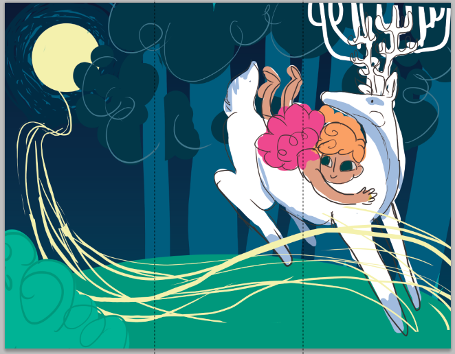
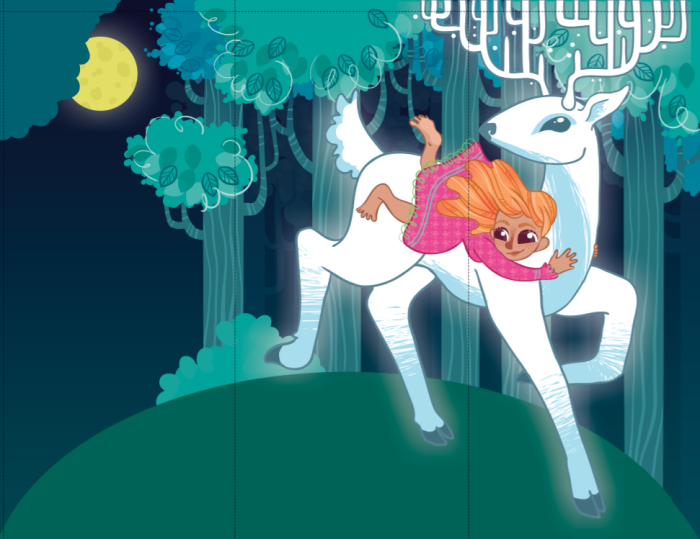
2010-06-14 [Chel.]: Heh....I like opening the two images and flicking them back and forth to see the progress.
2010-06-14 [arthemis_]: Hey, now she has breasts :P
2010-06-14 [Chel.]: Haha! XD
2010-06-16 [arthemis_]: and highlighted clothes... :P
2010-06-16 [Chel.]: I changed her proportions the most.
2010-06-22 [NOOOPE]: I like the top left best. You're too colorful a person for black or white and the top one feels more balanced than the one below it.
2010-06-22 [Aeolynn]: I like the teal one the most XD
2010-06-24 [pegasus1000]: I like the top left as well. The pics look matted. And for a former picture framer that is always a good thing.
| Show these comments on your site |
|
Elftown - Wiki, forums, community and friendship.
|